Why Quartz Countertops?

There are so many choices when it comes to countertops in the marketplace but my preference above all is quartz.  Quartz countertops contain crushed quartz mixed with resin.

Screen Shot 2015-08-30 at 4.22.39 PM

Zirconium - Platinum Series

Detalle-Istmo-1024x768

Itsmo - Nebula Code

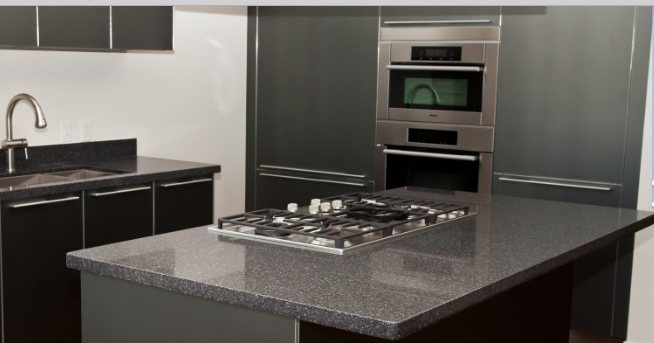
Read any trend article and you will find that quartz is the hottest choice in countertops.  With its reasonable price point and superior look and function, it's a product that is taking the place of granite, wood, and stainless steel countertops.   There are many manufacturers of quartz, but in my opinion Silestone manufactured by Cosentino stands out above the others.

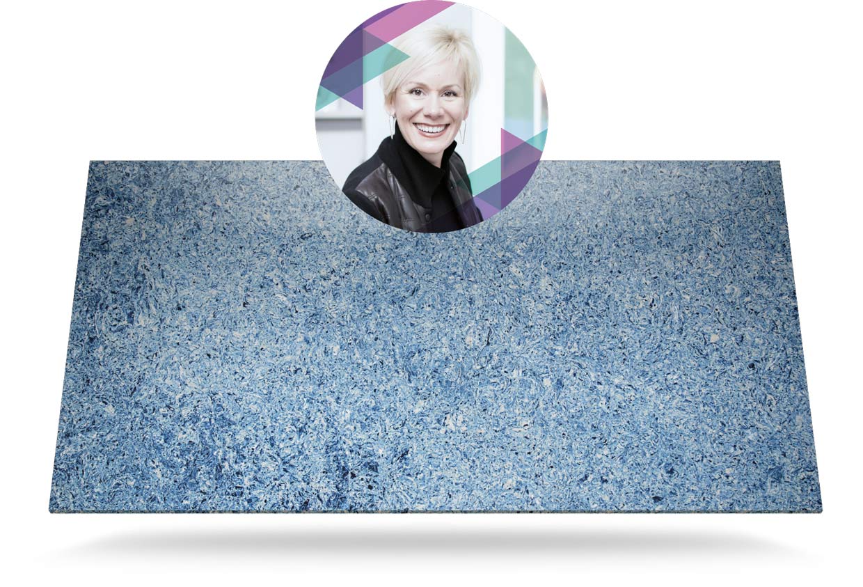
Here are just a few of the many colors they offer:

colors01

colors02

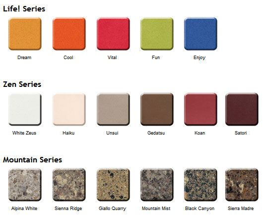
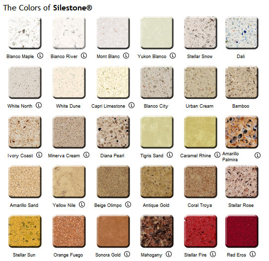
To see the latest colors click HERE.

Cosentino is a global, family-owned company that produces and distributes high value innovative surfaces for architecture and design.  It distributes its products in more than 60 countries from its headquarters in Almeria , Spain.  Silestone features:

 High quality

Stain resistant

Acid resistant

Scratch resistant

impact resistant

Bacteriostatic protection

Wide range of textures

Wide range of colors

Natural Quartz

Another advantage of Silestone's quartz surfaces is that they are easy to keep clean and maintain. In most cases they just need to be wiped over with a dry cloth to remove the dirt.

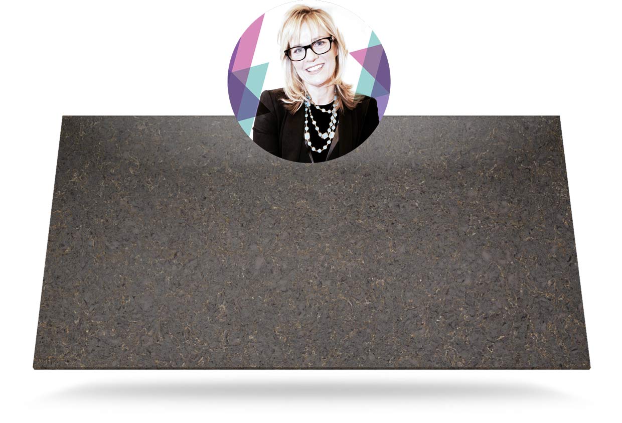
Just recently, Cosentino collaborated with designers from across the country to create new introductions called the Influencer Series.  The series was inspired by regional trends from each designer's market.

We were fortunate to be able to see these in person when we attended KBIS (the Kitchen and Bath Industry Show) in Las Vegas this past January with Modenus Blogtour.

By Courtney Cachet

Courtney Cachet is a designer and writer accustomed to never ending travel like around the south of France, where her family originated, a recent trip to Italy that broadened her outlook on the world and Miami the place she has made her home and a part of the world she knows very intimately. She has combined some of her favorite places and embellished them with her vital and stylish point of view.Lusso is a direct reference to the elegance and timeless appeal of marble. With this as her starting point, the designer wanted the color she created to adapt naturally to a wide variety of spaces.Cachet believes in consumer opinions "The numbers don't lie" she says and there's a reason why white is spreading around the world. But she wanted to add a personal flourish, as she says, the golden highlights, which she designed with great sensitivity and precision give Lusso it's elegance and a sense of glamour, which is her mark of distinction.

Nymbus

By Mark Williams

Light is everything for Mark Williams, this is the reason he takes it for granted that clients typically ask for light and bright designs featuring white and gray marble.For this Atlanta based designer, there is an inherent elegance in marble, something that is already there before any designer comes and attempts to give meaning to nature,"I wanted to create something as beautiful as that, with an unexpected sensitivity". As a result, he designed Nymbus in a soft gray that can be combined with a wide range of more saturated hues.Williams believes it is important to use colors intentionally, everything has a reason and spaces should be emphasized by placing focal points in specific places through strong colors; An interplay between designer and user, a dialogue between user and visitors to the spaces.Williams says that whites, grays, and taupes will monopolize the market and together with other more saturated colors, such as coral, navy, jade, and khaki. The aim is to create surroundings with a sense of individuality and adventure.

Copper Mist

by Julia Buckingham

copper-mist
The grandeur of certain settings leaves their mark on the people who come to experience them. They have a power to transform and influence and it is for this reason that the creation of interior designer Julia Buckingham is recognizable, defined and unique.Julia created a cocktail based on several years of inspiration in her design studio, the sophistication and grandeur of such a sublime urban setting that is Chicago, her city of residence, and a part of the mysticism drawn from her experience in the American Southwest, specifically from a place as distinct as the desert of Arizona.Its special earth tones, the broken lines of its bare mountains, the solitude of raw and empty nature and the purity of its dawn skies were a source of inspiration for Copper Mist.Mineral and earth, a bond that keeps us on the ground and reaffirms our condition of inhabitants of this planet; Copper as the color of the future, in a new age aesthetic of warmth with a hint of glamour.Buckingham says that she wants to turn unique spaces into little jewel boxes with Copper Mist. Little boxes that contain stones and precious metals, something precious, singular and with a connection to the place where she lives and grows.

Olivia

By Kim Lewis

We don't know how to redefine life and nature, this is probably because nobody can. But, as designer Kim Lewis says, everything is associated with the beauty and inspiration found in the things of nature. In other words, it can't be redefined but it can be interpreted and more particularly, experienced.Olivia was created precisely with an eye on nature, with the intention of introducing the exuberance and vitality of the outdoors into the home. Olive green, the inspiration for the name, combines with a wide range of colors to offer great versatility when it comes to imagining and creating.Lewis believes that there is life beyond white, naturally it is a timeless choice which is always a safe bet, but eschewing the conventional and choosing color is a perfectly valid option with striking impact.She believes that aesthetic trends are heading towards softer more pallid palettes, but also towards, pink, sky blue and mint green for a bit of fun and vigor. Pairing light colors with dark shades, almost black, creates eclectic combinations, but above all, they add a lot of life.

Albedo

By Kerrie Kelly

Kerrie Kelly loves to contemplate the moon and she often draws inspiration from its glow, its textures, and craters from its enchantment and hypnotic appeal.Her design Albedo is grounded in this inspiration channeled through the journey from her studio in northern California to the Cosentino factory in Spain, as a result the base color for Albedo reflects the hues of the moon's surface; She has enhanced it with blue veining, which situates her idea somewhere between earth and the moon.For the designer, navy blue is "A classic that combines well with many other tones and textures, it's versatile and easy to incorporate, It's timeless because it is fashion that never goes out of fashion, it's a winner". There is no doubt her design will be next season's big hit.

Needless to say, we can't wait to use these beauties in upcoming projects.  Just this summer we've  designed 7 new bathrooms!  Stay tuned for the before and afters of the transformations.

Have a great week!

joann

all photos via Cosentino